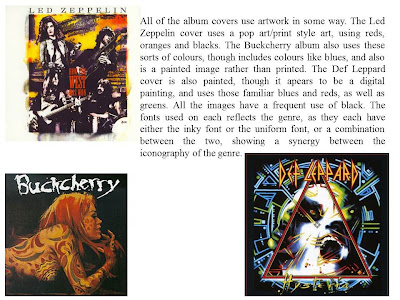
Initially, looking at Hard Rock was the plan, as the band who originally produced the song 'Vagabond' (Wolfmother) are actually a hard rock band. From this research on iconography, I found that hard rock uses very similar things, The colour schemes tend to be dark, using colours like reds, oranges and blues, as well as the obvious black. The fonts tend to be messy or inky, or use conventional fonts which have been altered to lay or look different. They also have a very similar image. The bands are all quite casual, and share this look, which also is a bit reminiscent of the 70's, when the movement took off.


No comments:
Post a Comment