We started practicing making digipacks which had the same feel as the ones we are making for our band. We got the template from Digi wizard.

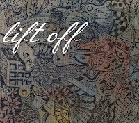
 I chose to use this image. I began by cropping the image down, then heightening sharpness and clarity. before fading the saturation. I then went on to the effects section, and did some experimenting with different effects. I used cross process to make the image deep blue. I then added a light Sepia tone to half of the image, and left the other half white and blue. I then used HDR and made the image colours less strong. I then added a dark film grain to make the image look a little dustier. The then overlaid a weave effect and a paint effect to give the image some texture. I also added 'lift off' to the image, as that is the bands name.
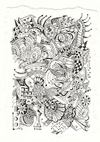
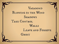
 I then went on to create the back cover of the digipack using this image as a base. I enhanced the clarity and sharpness. I then added a dusk effect which tinted the image a slightly yellowy brown colour, and topped this up using the sepia tone effect. I then added the names of the songs on to it. After being placed on the digipack, I will need to add a barcode and change the dimensions a bit.
This is the mock digipack with the first two images on. So far, there appears to be little synergy, but I plan to change that once I do the inside covers so the two link better. So far, the only real similarity is the air of old around them both. the colours could do with being more similar, and maybe the patterns could be, however for my actual digipack I plan to draw the images, so I can make them into whatever I want and create more synergy.
I used this image for the inside front cover. I cropped it to the rough size of a CD cover and so it was the right shape, then added sepia tone. I then used a weave effect underneath.


No comments:
Post a Comment