Tuesday 19 March 2013
Tuesday 12 March 2013
Tuesday 5 March 2013
Saturday 2 March 2013
Evaluation- What I have learnt from my audience feedback
In order to gain feedback on my media products I created a questionnaire on SurveyMonkey, with questions geared towards gaining both qualitative and quantitative data. By doing this, I hoped to gather the best information I would, with answers having numeral data and written data. Having quantitative date and qualitative data meant I could gather information which was written and explained the reasons for what the audience thought, as well as just what they thought.
http://www.surveymonkey.com/s/FP9CZ36
I also apologize for the fact that the entire page is on the PowerPoint; it was not when I uploaded it to Scribd, but now it has added these.
http://www.surveymonkey.com/s/FP9CZ36
I also apologize for the fact that the entire page is on the PowerPoint; it was not when I uploaded it to Scribd, but now it has added these.
Friday 15 February 2013


Thursday 14 February 2013
Homepage finalising
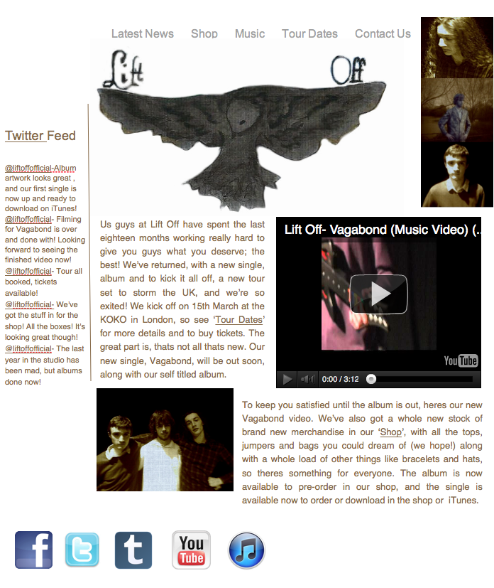
 Now the video is finished and up on YouTube I've added the video into the YouTube widget on my homepage. I now know that I need to tweak the size and positioning of the widget, as the size means that the video is hard to see, and looks awkward. I'm also really not sure what to think of the blue, as I don't think it works.
 I changed the background from blue to white, and I think this looks better. I've also removed the dodgy brown background from the logo, made it white, and made it a bit bigger. I've moved the writing a bit, and the widget, but it now looks oddly crowded, so I need to revise that a bit.
 I moved them around a bit more. I changed the side that the widget was on, and put one half of the text next to it, and the other under the video. I'm still not satisfied with this, as it looks really un-organised, and really unprofessional. I also added some social networking links, which would link to the bands Facebook, Twitter, Tumblr, and YouTube.
I went and added a picture of the band to the webpage, underneath the text, and this structure made it look much better. The picture was taken when we recorded, and I added this because it had the same costumes as in the video, and same effect as the images on the video, and drew a link between the three products.
 I changed the sides of the image and widget, with the text moved too. I'm still not sure on this, so I'm going to keep looking at it.
I thought about what some of the other websites had, and realised they had a twitter feed on their websites, so I added one to my page. Next to it, there is the picture of the whole band, and angled underneath is the video. I've moved the text a bit, but the way it is makes the page look too text heavy. I also added a link to the iTunes page with the social networks, as a lot of bands would have this so people could directly download their music.
Subscribe to:
Posts (Atom)