Showing posts with label Digipack and Design. Show all posts

Thursday, 14 February 2013

Homepage finalising

Now the video is finished and up on YouTube I've added the video into the YouTube widget on my homepage. I now know that I need to tweak the size and positioning of the widget, as the size means that the video is hard to see, and looks awkward. I'm also really not sure what to think of the blue, as I don't think it works.


I changed the background from blue to white, and I think this looks better. I've also removed the dodgy brown background from the logo, made it white, and made it a bit bigger. I've moved the writing a bit, and the widget, but it now looks oddly crowded, so I need to revise that a bit.


I moved them around a bit more. I changed the side that the widget was on, and put one half of the text next to it, and the other under the video. I'm still not satisfied with this, as it looks really un-organised, and really unprofessional. I also added some social networking links, which would link to the bands Facebook, Twitter, Tumblr, and YouTube.


I went and added a picture of the band to the webpage, underneath the text, and this structure made it look much better. The picture was taken when we recorded, and I added this because it had the same costumes as in the video, and same effect as the images on the video, and drew a link between the three products.


I changed the sides of the image and widget, with the text moved too. I'm still not sure on this, so I'm going to keep looking at it.


I thought about what some of the other websites had, and realised they had a twitter feed on their websites, so I added one to my page. Next to it, there is the picture of the whole band, and angled underneath is the video. I've moved the text a bit, but the way it is makes the page look too text heavy. I also added a link to the iTunes page with the social networks, as a lot of bands would have this so people could directly download their music.
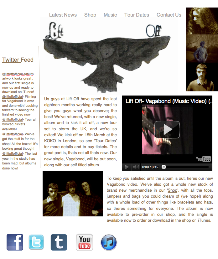


I then moved the twitter feed to the other side, and placed pictures where this were. These images are the ones which were on the digipack, so I thought it would be good to link them together. I then put the video up a bit higher, and gave the text/video/photo the same format as before, I then changed the text to a dark brown, to link it to the sepia used on the pictures. 

Friday, 1 February 2013

More work on the homepage

I began this time with the incredibly strenuous task of cutting the logo from the front cover using Gimp, and then erasing the edges and around the words. After this, I tried in vain to copy the image into iWeb, only for it to fail every time, and I had to save it and add it that way. I then had to edit it using a mask to hide the background which I had saved with it. 


I then clearly changed the set out of the page, and am in the process of changing the set out still. I've added the logo to the top above the writing, and ideally would have made that the same colour as the other boxes, but it would not let me, so I am considering changing the background colour to white, but not yet. I've also added the album cover to the page, with a little piece telling consumers when the album is due to be released. The other boxes are to have the Youtube link and and links to their social media sites on them, so will need to be changed in shape and size. 


Here's the current version of the page. I've made the logo larger, and shrunk the box which had the new album advertisement in it. This box links directly into the news box, though this could be changed depending on how I feel about it when I look at it next, as at the moment, I'm not sure about it. The boxes seem a little off, as instead of containing and separating everything, they seem to be messy and in the way. 

Thursday, 31 January 2013

Finished Digipack Design

This is the finished digipack. There are three images of the band, and three which have been drawn and inked, so there is an equal part of each. To add to synergy, I've given them all an edit which gives them the appearance of being weaved, and gives way to the old fashioned look which I aimed for using sepia tone, which there is also an element of in each. The sepia tone is also synergistic with the sepia tone that will most likely be used in the video. The images link with this too. There are tree's near the opening of the video, albeit they do not look like that, and the girl on the front cover is an art nouveau version of the girl within the video. The house and hill are reference to the 'mansion on top of a hill' mentioned on the song. The bird with 'Lift Off' written on the wings is clearly the bands logo. I am going to cut the logo out so that it can be used on my homepage. 

Friday, 25 January 2013

The Homepage

After last weeks editing of the website, I'm honestly at a bit of a loss as of what I should do to it now. I've stopped looking at the other pages, as I only need the hompage, and by looking at the other pages I am wasting time which could be used on this page. 


This is what I have of the homepage so far. It looks quite plain, so I am re-consulting the pages I looked at during research to see what they have on their homepages. These all had more plain backgrounds, or ones with no texture, so I changed my background to be plain black, which I actually much prefer.  

The Bob Dylan website has a homepahe which is full of news, with the option to change the page of the site on the side. I already have this bar, though mine is along the top, though I do think it looks better at the side, but iWeb doesn't allow for it to be anywhere but the top. 
 The Alberta Cross homepage has a piece advertising their new album along the top, which could be a good idea as it takes up more space, and means the album is in clear view from the start, and any advertising is done as soon as someone goes on the site, without having to look for it. It also has news all down the hompage, meaning the consumers are automatically updated. 
The Delain homepage has the bands latest news, the new video, the bands Twitter embedded, links to their social networking sites, and the next show that is coming up.
These pages can be seen elsewhere in my blog. Baring these in mind, I went back to my homepage to add these things. 

So, I've now changed the format a little bit, but I now feel it over overpowered by text, so I need to think how to change this, and maybe add images so it doesn't look so plain. It might be a good idea to replace the 'Homepage' with my logo, and I now actually prefer the other background I edited for it. I also think the black background looks much better, as its plainer, flatter and means the font stands out more.


Friday, 18 January 2013

More work on iWeb


I decided that I wanted my website to look more professional, and so went and looked at a few free wallpaper stocks which I could add to my site. I found these two, which are currently quite girly, but with some work could look much better, and much more synergistic with a little more editing. 


I rotated the image, then fixed the exposure so the image is slightly darker, and then made the image slightly sharper, so it looks more textured. I then added a small amount of Sepia to the image, as a lot of my images use sepia tone. This makes the image more synergistic and means that it looks less feminine, which was a problem with the stock image. 


I then did the same to the next image, which made it darker and more synergistic. 


I then got on to using these on my webpages. 

I started by adding it as a background to my titles of each page. This actually works well, as although the image has a different colour, the textures of the two are very similar, and look a bit like they have been weaved. I've done this on every page. I then decided to change the fonts on each page. I made this a font called 'Dutch and Harley' which was free on dafont.com. Now I need to make some decisions regarding the layout of these, as they all have white lines surrounding them where they have been carried over, and in some cased this looks messy, as the lines do not always add up, and the fonts are of different sizes. I've also decided to do no more work on the other pages, as it's more important that the homepage is done, especially as the other pages aren't needed.

Tuesday, 15 January 2013

More Digipack Work

I now have the other two photographs I planned to use  and edit. I am planning to edit them in a similar way to the first one I edited. I also have the drawn images prepared, and one inked already, which will be used on my digipack, as three images are photo's and three are painted. 

Friday, 11 January 2013

Webpage Creation (continued)

Here is more of the work I have done on the creation of the webpage with iWeb. I have began to change the way the pages look, add information, and make changes to formatting to make the pages more consistent.

The first page I added more onto was the 'Homepage'. I began by looking at different hand-written looking fonts to see which I thought would be the best for the headings of each page, and eventually went for 'Handwriting- Dakota'. I copied the text box containing the writing, which I made light grey to match the scheme of greys on the webpage, and pasted it in as the heading. This left me with a white box around the font which I wasn't expecting, but I liked it, so I kept it and kept it on each page after this. I also changed the image to a 'YouTube' widget, which once the music video is done and uploaded will show that. I now need to work on other parts of what the homepage will contain.
I then went on to the 'Latest News' page. I added the title of the page onto the top of the page, but decided to make the ones on this and the other pages smaller, but keep the box, and keep the width of the box the same on each. I then started writing a mock post form the band, which is talking about their new album, video, merchandise and tour dates. I will likely include some images, such as a mock up of a piece of merchandise or of the CD cover or band during recording at a later date. 
I then took a look at the 'Music' Section. This part will be tricky, because I will need to find a way to indicate that the 'Music' Videos', 'Song Lyrics' and 'Music Sheets' would be subsections and would have a drop box and link from them to each thing. So far I just have them written out, and have added a 'YouTube' widget to have the new music video shown as a way of advertising and synergy. Asides from this, this page is incredibly bare, so I plan to do a little more research to see how other bands websites set out this page.


I then looked at the 'Tour Dates' section of the site. I added the same font/box as before, and then went on to add the dates of the shows, which I made up based around when this part of the coursework will be completed by. I then went and looked a few less known bands and where they would perform, and used these locations as where the band would perform on their tour. I also added  a 'link' to the shop from this page, so consumers could link straight to the section of the shop where tickets are available, to add convenience for them. 


Friday, 7 December 2012

Practice digipacks

We started practicing making digipacks which had the same feel as the ones we are making for our band. We got the template from Digi wizard. 


I chose to use this image. I began by cropping the image down, then heightening sharpness and clarity. before fading the saturation. I then went on to the effects section, and did some experimenting with different effects. I used cross process to make the image deep blue. I then added a light Sepia tone to half of the image, and left the other half white and blue. I then used HDR and made the image colours less strong. I then added a dark film grain to make the image look a little dustier. The then overlaid a weave effect and a paint effect to give the image some texture. I also added 'lift off' to the image, as that is the bands name.


I then went on to create the back cover of the digipack using this image as a base. I enhanced the clarity and sharpness. I then added a dusk effect which tinted the image a slightly yellowy brown colour, and topped this up using the sepia tone effect. I then added the names of the songs on to it. After being placed on the digipack, I will need to add a barcode and change the dimensions a bit.


This is the mock digipack with the first two images on. So far, there appears to be little synergy, but I plan to change that once I do the inside covers so the two link better. So far, the only real similarity is the air of old around them both. the colours could do with being more similar, and maybe the patterns could be, however for my actual digipack I plan to draw the images, so I can make them into whatever I want and create more synergy.

I used this image for the inside front cover. I cropped it to the rough size of a CD cover and so it was the right shape, then added sepia tone. I then used a weave effect underneath. 

Friday, 23 November 2012

Official Logo Design

I decided on my final logo design which I am going to develop in Photoshop . The reason I chose this design is that that it depicts an eagle, which symbolises illumination of the spirit and the divine, both of which the band will see as being important when it comes to music, as they take their music very seriously and feel it should be emotion provoking and a higher power than anything else. This also links with how the band want to be very in touch with their fans, and want to help their fans via their music. They are also symbolic of courage and power, as they are large strong animals and are often regarded as the 'King of the Birds'. Likewise, the band want to show themselves as being strong, by giving out strong messages to fans, and not being afraid to speak out too much. 


I decided the bird would be black, even though it in an eagle, because the colour would stand out much more, meaning the logo would be much more noticeable. I also changed the font, as I wanted something a little smaller which had a slightly more unique font, as unlike the previous one it is not as unique or easily definable. 


Friday, 16 November 2012

Creating the Webpage


This is the first part of the webpage of 'Lift Off'. So far, I have only created every page, and done a very brief part of the Homepage. The homepage so far consists of a title, a small bit of text, and an image. The empty part of the homepage will have a decorated side panel which I will have to draw myself and add as an image at a later date. The fonts still need to be decided and changed, as do their colours and sizes. The image which is there will be replaced with an embedment of our music video after it is produced and uploaded. The pages along the side have all the different pages which will feature on the site, via a link at the top of each page. Homepage is clear. 'Latest News' will feature a link to the bands blog, and maybe their separate blogs, and the page will consist of latest news from the band, where they may have featured recently (magazines, TV, publicity, etc). 'Shop' will obviously be there online shop, where fans can buy CD's and other merchandise of the bands. 'Music' will have all of the bands music, including video's, lyrics and sheet music. 'Tour Dates' will have the dates and places of each tour and allow for fans to purchase tickets. 'Community' has the option to sign up to the site for message boards to connect with other fans and sign up for the bands weekly newsletter. 'Contact us' provides all the information for fans to interact with the band, including an address to write letters to, and an email address to send emails to. 

Practicing with iWeb software

Today is lesson we began to practice with iWeb creating a webpage. The purpose of the activity was that we got used to how iWeb functions, and how it works, especially with things such as inserting a youtube video, as these sort of things are really important when it comes to this project. I needed to be able to develop my skills before I created my ancillary webpage


This is a screenshot of my homepage. As it was just to practice the program, I didn't make this serious, and just did a slightly comedic one on Batman. I added several different pages to the sidebar so that I had the option to go on to these pages, and if clicked on, it takes you to these pages, though they are currently uncreated pages. I practiced using the 'Youtube' widget in order to insert a video, which was actually incredibly easy. I also added an image of Batman and Robin and the Batman logo in order to practice inserting an image onto a webpage. 

Overall, I found that iWeb was very easy to use, however, there is not enough freedoms for the page, as  some things did not move where I wanted and would not change colour how I wanted them too, which could prove to be a large problem with my actual site, and may lead to me drawing most parts of the site myself, and adding them in as images. 

Tuesday, 13 November 2012

Band Name and Logo

Our group has decided on the name 'Lift Off' for our band, as we all had idea's relating to birds. After deciding on the name, we went on to design separate logos of the band each.
As I was linking the logo to birds, I made a brainstorm of different types of birds and the things they symbolised, and made several rough sketches of example logos from each.
This is the brainstorm I made of different birds and their symbolic properties. Most of these have a relevance to the ethos I am giving the band.

As I'm aware my handwriting is hard to read, this is a list of all the things appearing on the brainstorm:
Owl- Mystery of magic, silent wisdom, (night) vision, deception
Condor- Mysteries of life and death, Spiritual communications, overcoming limitations
Eagles- Illumination of spirit, Healing, The divine
Peacock- Resurrection, Watchfulness, Pride
Phoenix- Rebirth, Immortality, Renewal
Swallow- Protection, Warmth, Home
Raven- Magic, Shape-shifting, Creation
Magpie- Intelligence, the occult
Canary- Power of Voice
Blackbird- Understanding energies of nature
Hummingbird- Joy, Nectar of life

The one's which seem the most relevant to the ethos of the band are Eagles, Phoenix, Ravens, Magpies, Canaries and Hummingbirds.
The Eagles are relevant as I wanted the band to be in touch with their fans, with the hope their songs could help their fans and evoke strong emotions within them.
The Phoenix is relevant as the idea of rebirth is something which making a band successful draws links with (as they are both new starts) and the hope of music is that it will become immortal, which is what I'd imagine the band to want.
Ravens are relevant as the idea of shape-shifting is relevant to the creation of a band, as creating a successful band includes a lot of things being altered, and although the band would not change themselves, it is more in the figurative sense, such as growing up.
Magpies are relevant as the band aim to present intelligence, and it also links to the origins of folk music, which was formed from old folk tales and traditions, and gradually evolved, much like the birds, and presumably the band.
The relevance of Canaries is obvious, as they are the power of the voice, and the band aim to have power through their music.
Hummingbirds are relevant as the band would hope to spread joy and life through their music.

Thursday, 1 November 2012

Webpage Design and Webpage Research

div class="separator" style="clear: both; text-align: center;">


This is the website design I came up with from the moodboard I created. The left hand corner is where the band logo goes, and below this is the navigation bar for the website. The circle next to the 'HOME' button is actually a bouncy ball, and moves to different parts of the bar based on what page the veiwer is on. Clicking the larger words which have arrowed words under them leads to a page with the same design, but in the space has boxes with the links to the options within it.

Mood board


Here is my moodboard for the band image and webpage/digipack. As the song sounded very folk rock to me, I took things which reminded me of folk rock. I created a colour swatch of blue and purple tones, as these reflect the blue's influence of folk rock which are evident in 'Vagabond'. The bouncy ball is reflective of the bouncy beat in the song. The drawn images remind me of folk rock, as its very raw, and hand drawn images reflect this rawness.

Friday, 5 October 2012

Genre Iconography


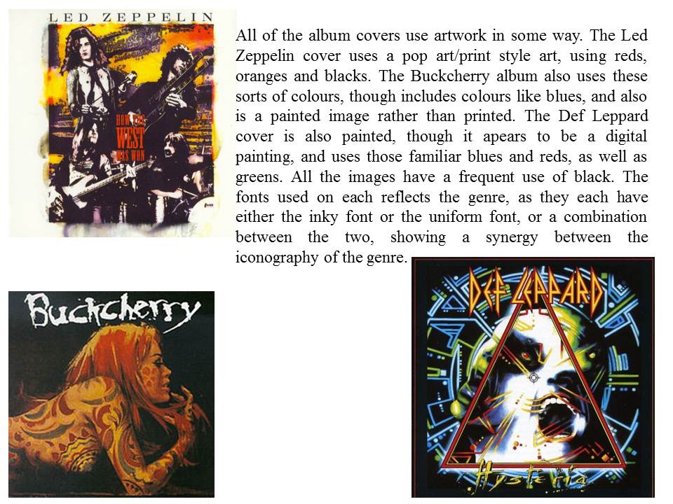
Initially, looking at Hard Rock was the plan, as the band who originally produced the song 'Vagabond' (Wolfmother) are actually a hard rock band. From this research on iconography, I found that hard rock uses very similar things, The colour schemes tend to be dark, using colours like reds, oranges and blues, as well as the obvious black. The fonts tend to be messy or inky, or use conventional fonts which have been altered to lay or look different. They also have a very similar image. The bands are all quite casual, and share this look, which also is a bit reminiscent of the 70's, when the movement took off.