
Friday 15 February 2013

Thursday 14 February 2013
Homepage finalising
 Now the video is finished and up on YouTube I've added the video into the YouTube widget on my homepage. I now know that I need to tweak the size and positioning of the widget, as the size means that the video is hard to see, and looks awkward. I'm also really not sure what to think of the blue, as I don't think it works.
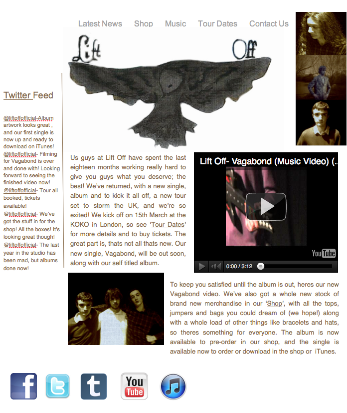
 I changed the background from blue to white, and I think this looks better. I've also removed the dodgy brown background from the logo, made it white, and made it a bit bigger. I've moved the writing a bit, and the widget, but it now looks oddly crowded, so I need to revise that a bit.
 I moved them around a bit more. I changed the side that the widget was on, and put one half of the text next to it, and the other under the video. I'm still not satisfied with this, as it looks really un-organised, and really unprofessional. I also added some social networking links, which would link to the bands Facebook, Twitter, Tumblr, and YouTube.
I went and added a picture of the band to the webpage, underneath the text, and this structure made it look much better. The picture was taken when we recorded, and I added this because it had the same costumes as in the video, and same effect as the images on the video, and drew a link between the three products.
 I changed the sides of the image and widget, with the text moved too. I'm still not sure on this, so I'm going to keep looking at it.
I thought about what some of the other websites had, and realised they had a twitter feed on their websites, so I added one to my page. Next to it, there is the picture of the whole band, and angled underneath is the video. I've moved the text a bit, but the way it is makes the page look too text heavy. I also added a link to the iTunes page with the social networks, as a lot of bands would have this so people could directly download their music.
Wednesday 13 February 2013
Tuesday 12 February 2013
Editing- 12th/13th February
12th February- We started off by watching the video so we knew what we had of it, and what we needed to do. A problem we have is that there are still a few places where footage is needed as they are just gaps right now, and not even the sort of gap which could we used as an effective part of the video . As this wasn't a huge problem, we just went through the footage and looked for pieces which were good and would fit. We managed this quite quickly, and moved on to looking at effects. The main effect we looked at was overlaying the clips, and to do this we used the opacity option under clip motion.
13th February- Now all of the footage is in and synced up, we're on to adding effects. We need to add these effects in order to give the video a more professional feel, as at the moment it looks quite mediocre right now. Right now we're planning on looking at the effect of colour correction, sepia tone, and opacity. Sepia tone is one which is important, as both of us have used Sepia tone within our album covers, and realistically need this within our video to create synergy.
We started trying to use sepia tone, but at current it doesn't look as though it will work because of the lighting on the performance element being too dark, and it doesn't work on the narrative as it takes everything away from the footage. As a result, we've decided not to use sepia tone, but hopefully this will not take away from the homepage and digipack.

We also made a band identity to go on the beginning and end of the video, which has the artist, album and song on it. Because of the constraints of the program used (LiveType) we could not change the colour of this from blue to brown, so it would be similar to sepia tone, like we planned as a way of creating synergy. Although we're disappointed we couldn't give this the same branding as our other products, it at least looks professional, which is agreeably better than having a very amateur one in the right colour.
Wednesday 6 February 2013
Over Coming Editing Problem
Here is Andrew, who I edited with, talking about a problem which we enountered during editing, and how we fixed it.
Friday 1 February 2013
More work on the homepage
I began this time with the incredibly strenuous task of cutting the logo from the front cover using Gimp, and then erasing the edges and around the words. After this, I tried in vain to copy the image into iWeb, only for it to fail every time, and I had to save it and add it that way. I then had to edit it using a mask to hide the background which I had saved with it.


I then clearly changed the set out of the page, and am in the process of changing the set out still. I've added the logo to the top above the writing, and ideally would have made that the same colour as the other boxes, but it would not let me, so I am considering changing the background colour to white, but not yet. I've also added the album cover to the page, with a little piece telling consumers when the album is due to be released. The other boxes are to have the Youtube link and and links to their social media sites on them, so will need to be changed in shape and size.

Here's the current version of the page. I've made the logo larger, and shrunk the box which had the new album advertisement in it. This box links directly into the news box, though this could be changed depending on how I feel about it when I look at it next, as at the moment, I'm not sure about it. The boxes seem a little off, as instead of containing and separating everything, they seem to be messy and in the way.
Subscribe to:
Posts (Atom)